Pie charts are used to compare multiple values at a single point. The sum of all quantities is 100%. They are not suitable for comparing different quantities. The circle is the whole. Sectors - the components of the whole.
It happens that one of the fractions of a circle is very small. To improve perception, it can be “unfolded” using a secondary pie chart. Consider building in Excel.
Features of data presentation
To build a secondary pie chart, select the table with the original data and select the "Secondary Pie" tool on the "Insert" tab in the "Charts" group ("Pie"):
- Two diagrams are always placed in the same plane. The main and secondary circles are next to each other. They cannot be moved independently. The main diagram is located on the left.
- The main and secondary diagrams are parts of a single data series. They cannot be formatted independently of each other.
- The sectors on the secondary circle also show the shares as in the regular diagram. But the amount of interest does not equal 100, but is the total value of the value on the sector of the main pie chart (from which the secondary is separated).
- By default, the last third of the data is displayed on the secondary circle. If, for example, there are 9 lines in the source table (9 sectors for a diagram), then the last three values will appear on the secondary diagram. The original location of the data can be changed.
- The connection between the two diagrams is shown by connecting lines. They are added automatically. The user can modify, format, delete them.
- The more decimal places for fractional numbers in the original data series, the more accurate the percentages on the charts.
How to build a secondary pie chart in Excel
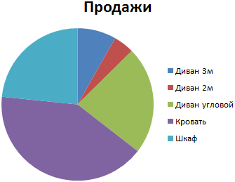
The following data is available on sales of certain groups of goods:
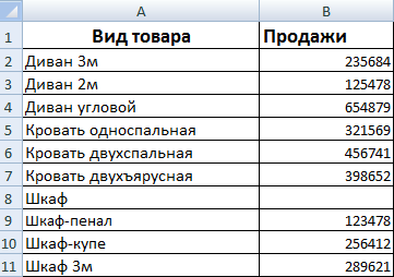
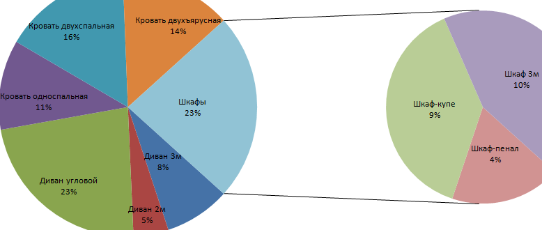
They are immediately located so that the secondary pie chart is built correctly: you need to detail the sales of different cabinets.
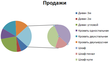
Select the table together with the headings and go to the "Insert" tab in the "Diagrams" group. Choose "Secondary Circular." It turns out approximately the following result:
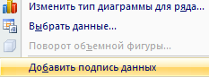
We right-click on any segment of the circle and click "Add data signatures".
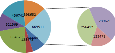
The numerical values from the table appear:
We right-click on any signature - everyone should be selected. Go to the tab "Format of data signatures."
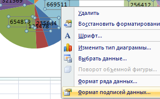
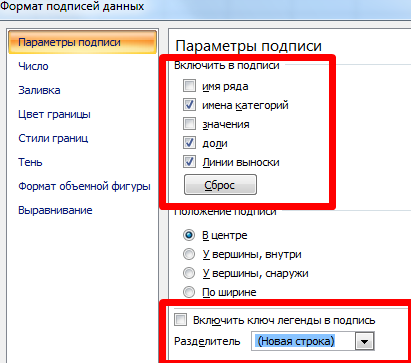
In the context menu "Signature options", select "Shares", and tick off the "Values" is removed. If left, both values and shares are displayed. Also note "Category Names". In the field "Separator" set "New Line".
Delete the legend to the right of the pie charts (select - DELETE). Adjust the size of the circles, move the signatures on the sectors (select - hook on the mouse - move). We get:
The word “Other” on the main diagram is replaced by the word “Cabinets”. Double click on the caption to blink the cursor. We are changing.
You can work on styles, colors on parts of diagrams. And you can leave it like this.
Now let's see how to detail a segment of a regular pie chart.
Add signatures as percentages. This can be saddled in another way (not as described above). Go to the "Designer" tab - the "Chart Layouts" tool. Choose a suitable option among those offered with interest.
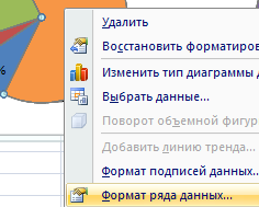
Sector 4% is viewed poorly. Detail it with a secondary pie chart from smaller to larger. Find the button “Change chart type on the“ Designer ”tab:
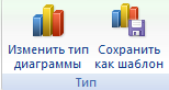
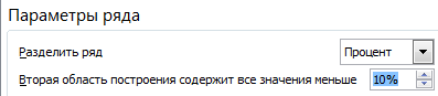
The automatic option “transferred” the last two values in the table with the source data to the secondary chart. In this form, the picture does not solve the problem. Click on any part of any circle so that all segments stand out. The right mouse button is “Data series format”.
In the "Row Parameters" menu, we offer the program to divide the series by "percentages". Place values less than 10% in the secondary diagram.
As a result, we get the following display option:
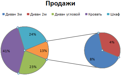
Areas with minimal percentages (4% and 8%) are included in the additional diagram. The sum of these shares constituted a separate sector in the main diagram.
The areas of 4 oceans are equal. (Fig. 1.)
Fig. 1. Squares of 4 oceans
Very hard to digest information.
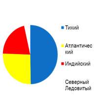
Now let's see what part of the total ocean surface each ocean occupies (Fig. 2).

Fig. 2. Part of the occupied surface of each ocean
Already easier.
And now look at the pie chart (Fig. 3).

Fig. 3. Pie chart
Everything was very clearly visible.
· The Pacific Ocean is equal in area to the rest combined, it is half of all ocean water.
· The Indian and Northern Arctic together are slightly smaller than the Atlantic.
With the help of sight, a person receives about 80% of all information, 15% through hearing, the rest falls on all remaining organs of sense.
Therefore, it is convenient for him to receive information through illustrations, graphs, diagrams (Fig. 4).
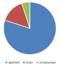
Fig. 4. Pie chart
Charts do not provide new information. All information was already contained in the numbers.
The diagram is needed to present information in a more readable form.
Here is our pie chart again. We also add a columnar. Compare them. (Fig. 5.)
 |
 |
Fig. 5. Pie and Bar Chart
In the pie chart, we see the amount, the total quantity. This is a whole circle. In this case - the area of the world ocean (all oceans). And each value separately is a part of a circle, a sector. Each has its own color. And we immediately see what contribution each value makes to the whole. We see her share. Pie chart for this and need - compare the fraction of several quantities.
The bar chart does not show the entire quantity. But it clearly shows the greatest value and the smallest. It is convenient to compare two neighboring values - for example, the Atlantic and Indian oceans.
It remains to learn how to build pie charts.
Construct a pie chart, which was seen at the beginning of the lesson. About the oceans.
First we need a table with data.
It is necessary that the units are the same. We have it. More we do not need them.
The circle is also 360 degrees, and it is necessary to distribute 4 areas in proportion. We don't even have to count anything.
Draw a circle, a future diagram (Fig. 7).
1. Find how many degrees will occupy the Pacific sector.
It should occupy the same part of the circle, which occupies the area of the Pacific Ocean in the total area:
![]()
2. Build a sector for the Atlantic Ocean.
Similarly, its angle is 93.
We build the second sector, we paint in yellow.
3. Indian 75 ![]() .
.
4. Arctic 13 in white color.
So that the rest could understand where the oceans are, next to the diagram we will decipher our colors (Fig. 6).
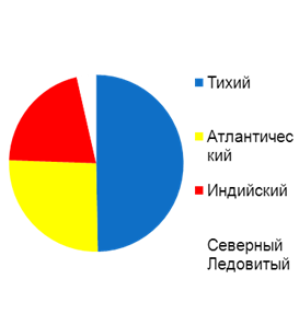
Fig. 6. Chart
When Petya began to study the list of his friends in VK, he understood that:
12 people are his relatives.
24 people are classmates.
36 people - acquaintances from school, yard, sports section, etc.
And he never saw 48 people at all.
Build a pie chart illustrating the structure of Petya's friends in VK.
Let's display everything in the table.
We calculate how many friends there are.
1. Let's start with relatives. Among the 120 friends, relatives occupy the same proportion as the desired angle of 360 degrees.
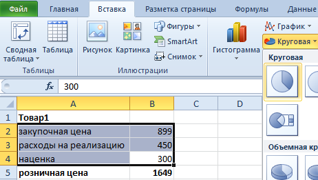
Often in reports it is necessary to display in Excel of how many parts is the 100% integrity of a certain indicator and how many percents fall on each part of it. For example, to find out the profitability of a product, we need to split its selling price into parts: the purchase price, cost recovery, mark-up. Pie charts with different colored sectors are good for displaying shares. Let us consider in more detail on a specific example.
Pie charts with percentages in Excel
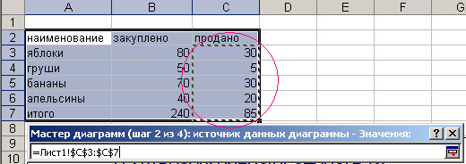
Suppose we have a conditional product, which we all know in numbers. But we need to determine what parties to sell it. If its margin is 15% -20%, then this product will be sold only in bulk, and if more than 20% - retail. The retail price for this product should not exceed 1700, and wholesale - 1400. Low-margin products will be considered with a markup of less than 15%. Now fill in the table, as shown in the picture:
Let's make a pie chart with percentages:
Select the range B2: B4 select the tool: “Insert” - “Charts” - “Circular”.
If you click on the chart, we activate an additional panel. On it, select the type of display with a percentage ratio of shares: “Working with charts” - “Designer” - “Layouts of charts” - “Layout 6”.
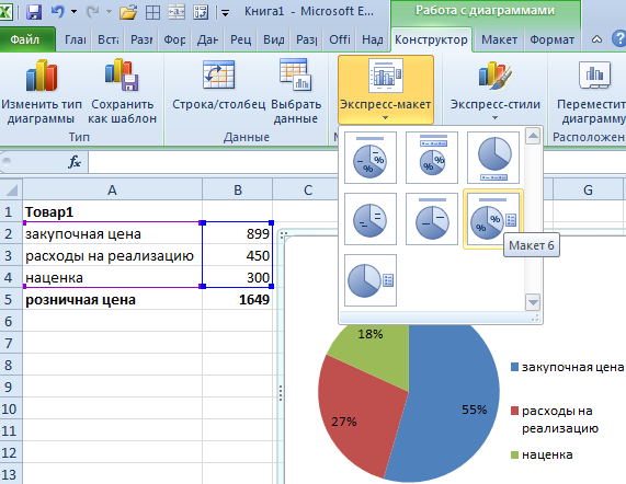
Now we clearly see that the margin is better to increase by 50 and sell this product at retail. Since the wholesale parties to implement it will be unprofitable.
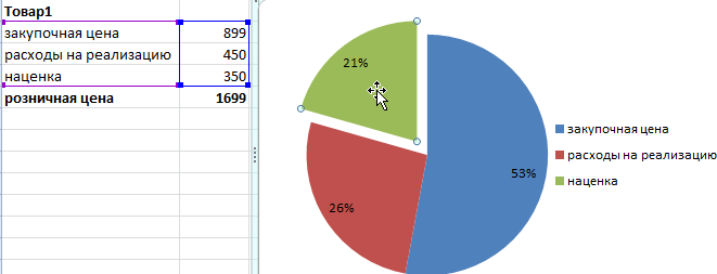
Exposure markup to increase the presentation of the chart. To do this, first click on the circle diagram. And the second time directly in the margin sector. Then, holding the left mouse button, slightly shift the margin sector.
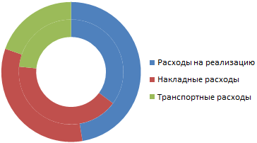
Donut with percents
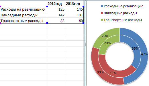
We present with the help of a chart a table with data on the activities of the company for 2 years. And compare them in percentage. Build the following table:
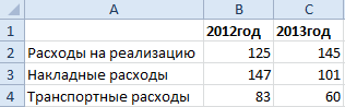
To solve this problem, you can use 2 pie charts. But in this example we will use a more efficient tool:
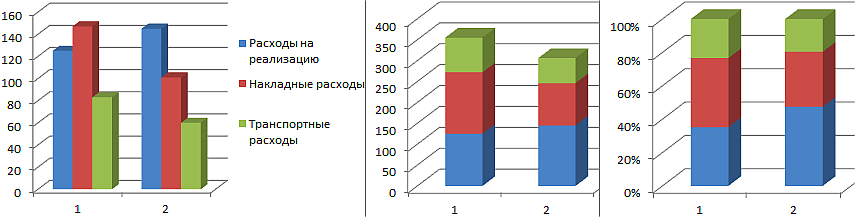
The main goal of these two examples is to show the difference between different types of diagrams and their difference in front of histograms. We consider them in the following example.
Percentage histogram
Now let's look at how to make a percent bar graph in Excel. For example, let's take the same table and present it with the help of 3 histograms at once. Select the range of cells A2: C4 again and select: “Insert” - “Chart” - “Histogram”:
- “Volumetric histogram with grouping”;
- “Volumetric histogram with accumulation”;
- “Volume normalized histogram with accumulation”.
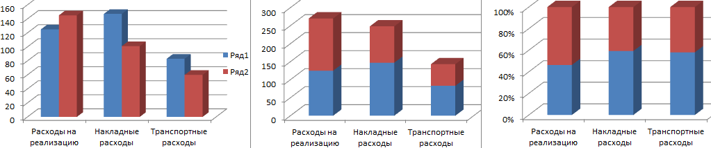
Now on all created histograms, use the switch: “Working with charts” - “Designer” - “Row / Column”.
Initially, when creating histograms, Excel placed the default years in the rows, and the names of the indicators in the categories. Since the names are more they fall into the category. But we needed to compare the indicators by years and for this we changed the rows with columns in places using the "Row / Column" switch.
Briefly describe what each type of histogram in this example displays:
- Volumetric histogram with grouping - allows you to evaluate changes in all types of expenses. It is known that they have changed, but it is not known whether there are significant changes in the percentage ratio?
- Volumetric histogram with accumulation - you can easily estimate the total cost reduction in the 2013th year. But it is still unknown how the situation has changed as a percentage?
- Volumetric normalized histogram with accumulation - it is clear that the amount of transportation costs in percent has not changed significantly. Significantly increased implementation costs. And overhead costs on the contrary decreased. But on the other hand, we do not know the absolute values and the total changes.
Each type of chart has its own advantages and disadvantages. It is important to be able to correctly select the method of graphic display for various kinds of data. This science teaches "Infographics."
Consider an example
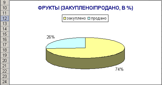
Suppose you need to show in the chart the percentage of purchased and sold fruit.
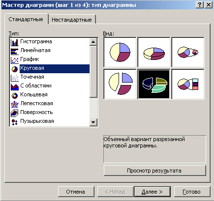
Select the table area. We press on the button of the master of diagrams, there we choose a pie chart, take for example the second
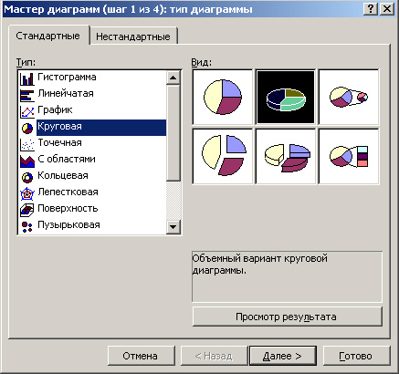
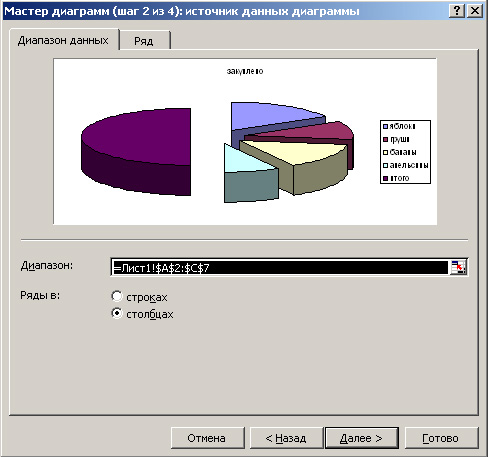
The range of data is selected "in rows"
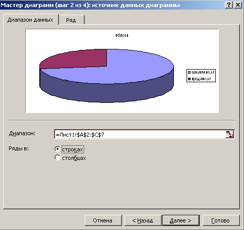
Now click the "Row" tab.
Select the name of the chart. Clicking on the red arrow, we can select the cell with the desired name, if there is none, we can simply select any cell, then it can be corrected.

when we have selected the cell, press Enter, we get back to our window “Initial data”. In the same way we choose the values that the chart will reflect. Namely - click on the red arrow, mark the data range with the mouse, press Enter

Do the same with category signatures.

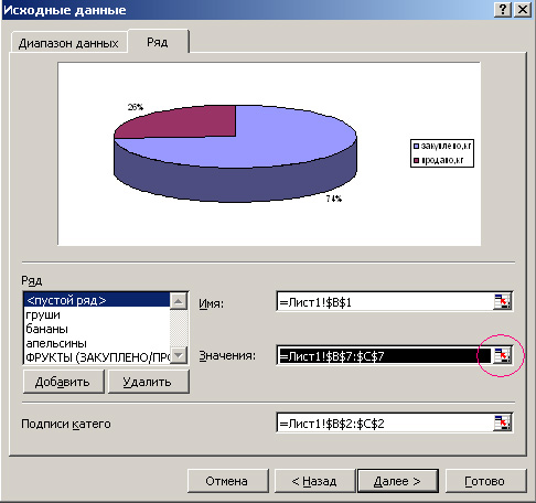
The chart wizard opens (step 3 out of 4).
Here, in the “Headings” tab, we will just write the desired name of our diagram, for example: FRUITS (PURCHASED / SOLD%)

In the “Legend” tab, we can choose whether we even have a legend or not, and if so, we will choose its location. For example, "above"
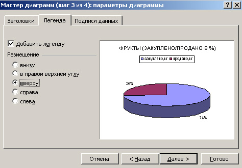
Go to the tab "Data Signatures". Since we want to see the percentage of purchased and sold goods, we select and tick the “shares”

![]()
The finished chart can be dragged to any place on the page, you can change the colors of the sectors, title and legends, as described here. Yes, the legend itself can also be dragged to any place on the diagram. We click on it once with the mouse, it outlines the frame, brings the mouse to the edge of the frame and click and drag where necessary. If you need to change the text in the title, you can simply double-click the name of the mouse with a small pause (just like changing the name of the folders in the computer). Here, for example, the changed colors and chart title

Now one thing doesn’t coincide with us - the legend says “purchased, kg”, and in fact we have a percentage diagram. You can simply in the plate itself, in the cell where the column is entitled to remove ", kg" and then we get this:

For clarity, you can also make two schemes - how many purchased in kg and how much sold in kg.
First, we make as much as purchased, then according to the same scheme as sold.
Select the entire area of the table, click on the button of the wizard diagram. Choose a pie chart. For example. just such
The range of data is selected "in columns".
In the “Row” tab, we do not change anything, since the legend shows that the apples, pears, bananas, and oranges we need are selected by default. J
Moving to the Diagram Wizard, the third step is changing the title of the diagram. Let's write: FRUITS (PURCHASED), KG

In the “Legend” tab, again, we’ll select what the legend will look like (I will also choose from above), go to the “Data signatures” tab. Here you can choose what will be displayed on the diagram, I think, in our case, just the values will suffice. Check off the “values” and click Next.

The last step - choose where the diagram will be, I selected on the same sheet, and click "Finish". Here, we will place the resulting diagram in the right place on the page. For clarity, you can one under the other. It is also possible to change the colors of the sectors, the title and the font color and background of the legend. As well as the background color of the whole chart.
According to the above described plan, we make a diagram of the fruit sold. The only difference is that when we are in the “Diagram Wizard Second Step” tab, we need to select the “Row” tab, and by clicking on the red arrow at the end of the “value” column, select the range of data on which the chart will be built

and press Enter.
Now we have three diagrams that beautifully and clearly reflect the boring statistics of our table.

Yes, the most interesting thing is that if there is a need to change something in the diagram, you just need to select it with a click of the mouse and, clicking the diagram wizard, make any desired changes there.
Sometimes in our table there are not relative, but absolute values, but on the diagram we need to have exactly the relative data values, that is, signatures as percentages. This can be done, but if there is no experience in Calc, then it is somewhat difficult. This article is about how to make percentage signatures on a pie chart in LibreOffice Calc. I would like to note that I will mainly disassemble only the signatures on a simple pie chart, although on other types of pie charts, signatures as percentages are made similarly. Details about the construction of pie charts can be found in the article.
For example, let's take property taxes to the consolidated budgets of the constituent entities of the Russian Federation for 2012. Create a table that will look like this:
Select the range A3: B7 and launch the master diagram. In the first step, select the type of diagram “Circular” and under the type “Regular” and go straight to step four. At this step, we indicate the title: Property taxes to the consolidated budgets of the constituent entities of the Russian Federation for 2012. And click "Finish".
Do not exit the diagram editor, and if left, double-click the diagram with the left mouse button (or right-click once and select “Edit” in the context menu). The title is divided so that it looks normal. And proceed to set up signatures.
Let's click on the circle of the diagram with the right mouse button and select the item “Data signatures” in the context menu.
We will have on the chart the data signatures indicated in the table.
Click on the circle of the diagram with the right mouse button and in the context menu select the item “Format of data series ...”.
It should be noted that if you right-click on one of the signatures, the menu will be somewhat different, but the menu item will still remain the same.
In order for us to have only interest signatures on the chart, we need to uncheck “Show value as number” and tick “Show value as percentage”.
The button "Percentage format" allows you to set the format for displaying numbers with percentages. By clicking on it, we will see the following picture:
To change the format of the number you need to uncheck the "Original format". After that, you can choose the format from the proposed or set your own. For example, in order to display percentage signatures on a diagram with only one decimal place, you need to specify 0.0% in the Format Code field, and that with three decimal places you should specify 0.000%.
I want to note that if you specify several checkboxes in the data signature settings window, then all the indicated ones will be displayed in the diagram. So, for example, it is possible to show at the same time and monetary units (for our case) and percent.
Drop-down list "Placement" allows you to customize the placement of signatures on the chart. It has four meanings:
- “Optimal scaling” - in this mode, the program chooses the best way to show signatures;
- “Outside” - the captions will be shown outside the circle of the diagram, it will narrow the diagram a little, but if you have a lot of small values, it may increase readability;
- “Inside” - signatures will be shown near the circle, but from the inside;
- "Center" - signatures are shown in the center of the data block (point).
The "Font" tab in the "Data Signatures ..." window allows you to set the required font and its size. A tab "Font Effects" to set different aesthetic properties of signatures. Sometimes they can make the chart much easier to read.
Overline, Strikethrough, and Underline have 16 styles each. In addition, for Overline and Underline, after selecting a style, you can select a color in the drop-down list to the right of them. The checkbox "Only words" allows you to exclude spaces and punctuation. Therefore, if you use only percentage signatures, its use does not make sense.
The “Relief” has 2 styles: elevated and recessed. The “Contour” and “Shadow” items are active only when “Relief” is set to “no”.
For example, I chose “Relief” “Raised”, “Underline” put it in “Unary” and the color for it indicated “Gray 5”. The result was such a percentage pie chart.